
Most TikTok Shop operators aren’t making data-driven decisions. They’re making dashboard-driven ones — and those aren’t the same thing.
There’s an important distinction here. A dashboard-driven operator opens Seller Center each morning, checks GMV and orders, feels good or bad about the number, and moves on. A data-driven operator has configured a structured data layer beneath those surface numbers — one that feeds a purpose-built command center exposing contribution margin by SKU, true attribution by traffic source, and live shopping conversion rates by session. That operator isn’t reacting. They’re operating.
The gap between the two isn’t talent or budget. It’s architecture. TikTok Shop has matured enormously as a commerce surface, but the native analytics tooling has not kept pace with what serious operators actually need. Seller Center gives you GMV. It doesn’t give you a profit view. It gives you conversion rate. It doesn’t distinguish between a content-driven sale, an affiliate-driven one, and a paid ad that happened to show up last in the attribution window.
This post is a technical and strategic blueprint for closing that gap. We’ll cover the three-layer data model that underpins every well-run TikTok Shop, the specific instrumentation you need to track events accurately, why GMV Max attribution inflates your reported ROAS, how to model SKU-level contribution margin as a daily operating metric, and how to wire it all into a command center that actually tells you what to do each morning. No vanity metrics. No inflated attribution. Just the numbers that connect to real profit.
Why the Native Seller Center Dashboard Isn’t Enough
Before building anything, it helps to understand exactly what TikTok’s native analytics surface does well — and where it structurally cannot go.
TikTok Shop Seller Center’s analytics module gives you four core metrics at a glance: GMV, orders, units sold, and conversion rate. You can segment these by custom date ranges, view trend lines, see percentage changes versus prior periods, and drill into product-level breakdowns. For a seller doing their first few thousand dollars a month, this is genuinely useful. For anyone operating at scale, it’s the floor, not the ceiling.
The GMV Problem
The first issue is definitional. TikTok’s GMV figure includes orders that have not been paid, orders that have been refunded, and orders that were later cancelled. This means the headline number you see each morning systematically overstates realized revenue. The gap between GMV and actual collected revenue — what operators sometimes call “Net GMV” or “Settled GMV” — can be significant depending on your category. Apparel and fashion sellers running return rates of 20–25% can find that their true revenue is 15–20% below the GMV figure they’re optimizing toward.
This isn’t just an accounting nuance. If your fulfillment team, ad budget, and inventory reorder logic are all anchored to GMV, you’re calibrating an operation against a number that doesn’t represent cash in the door.
The Conversion Rate Problem
The second issue is that Seller Center’s conversion rate is a blended metric. It aggregates all traffic sources — paid ads, organic video, affiliate content, direct search, and LIVE sessions — into a single denominator. A seller with high-quality affiliate content driving warm purchase-ready buyers will show a different conversion rate than one relying on cold top-of-funnel paid traffic. Both will get the same single number in their dashboard, and that number tells neither of them what to actually do.
Effective operators need conversion rate by traffic source. More specifically, they need: organic video conversion, affiliate-driven conversion, paid ad conversion, and LIVE shopping conversion as separate metrics. Each of these responds to completely different optimization levers. Mixing them into one number is analytically equivalent to averaging your product reviews across categories and calling it your “reputation score.”
The Attribution Problem
The third issue is depth. Seller Center shows you product-level performance but doesn’t expose the content→click→purchase chain at a granular level. Which specific video drove this SKU’s spike on Tuesday? Which affiliate’s content has the best click-to-order rate — not just total orders? Which LIVE session produced the highest GMV-per-viewer? These questions are answerable, but not through the native UI alone. They require instrumentation at the data layer level.
The Seller Center analytics dashboard is a summary view. What operators need is a source-of-truth layer that makes those summaries auditable, correctable, and composable with cost data.
The Three-Layer Data Architecture That Serious Operators Use
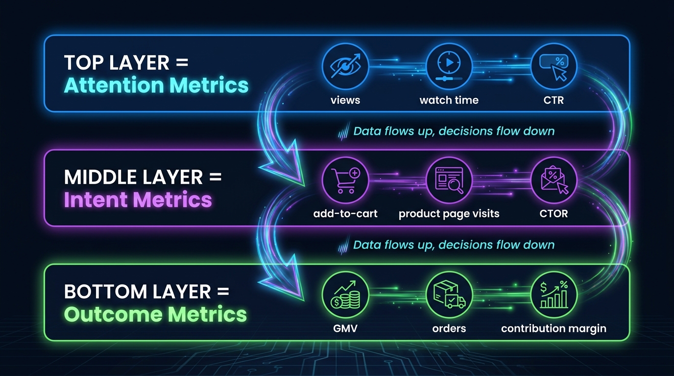
The most coherent framework for thinking about TikTok Shop analytics — one that the most sophisticated operators and agency teams have converged on — is a three-layer model organized around the buyer’s journey: Attention → Intent → Outcome.
This isn’t just a conceptual frame. It maps directly to where different data types live, which systems produce them, and how they feed different parts of your command center. Understanding each layer is the prerequisite to building anything useful.
Layer 1: Attention Metrics
The Attention layer captures how your content performs before anyone shows purchase behavior. These metrics live primarily in TikTok’s Content Analytics and Ads Manager, and they answer the question: Is our content reaching the right people and holding them long enough to matter?
Key metrics at this layer include video view rate (views / impressions), average watch percentage, watch-to-click rate (sometimes called CTR in the context of product link clicks), and reach-adjusted engagement. For LIVE sessions, the equivalent metrics are peak concurrent viewers, average watch duration, and viewer retention curves across the session timeline.
What separates good operators here isn’t tracking these metrics — everyone has them. It’s knowing their relationship to the layers below. A video with a 60% watch-through rate and 3% CTR is a very different asset from one with a 25% watch-through rate and 8% CTR. The first is building brand familiarity; the second is driving direct purchase intent. Both are valuable, but in entirely different ways, and collapsing them into a single “content performance” view loses that distinction.
Layer 2: Intent Metrics
The Intent layer is where the funnel gets selective. Someone moved from passive viewer to active browser — they tapped the product link, visited a product detail page, or added an item to cart. The key metrics here are: product page views (PDV), click-to-order rate (CTOR), add-to-cart rate, and checkout initiation rate.
This layer is also where your data layer instrumentation becomes critical. TikTok’s native reporting will show you aggregate intent signals, but to understand which specific content asset drove which product page visit, you need event-level tracking with content attribution parameters attached. That means the TikTok Pixel or Events API must be receiving structured ecommerce events — ViewContent, AddToCart, InitiateCheckout — with the right metadata attached to trace the journey back to its source.
Intent metrics also flag friction. A high add-to-cart rate with a low checkout initiation rate points to a checkout experience problem, not a content problem. A high CTOR from one traffic source and a low one from another tells you something about audience quality that pure GMV numbers never will.
Layer 3: Outcome Metrics
The Outcome layer is where revenue lives, but the mistake most operators make is stopping at GMV. True outcome metrics for a well-instrumented TikTok Shop include: completed orders (not GMV), net settled revenue (after cancellations and refunds), cost per order (CPO) by traffic source, and contribution margin per SKU and per channel. These are the metrics that connect directly to business health.
The three layers aren’t siloed. They’re connected by the data layer infrastructure you build — and data flows upward through that infrastructure while decisions flow down. A drop in CTOR at the Intent layer may trace back to a decline in watch-through rate at the Attention layer, which means the fix is content-side rather than product-side. Without the layered model, you’d see lower orders and guess at causes. With it, you trace the problem to its actual origin.
Instrumenting Your Data Layer: The Pixel + Events API Hybrid
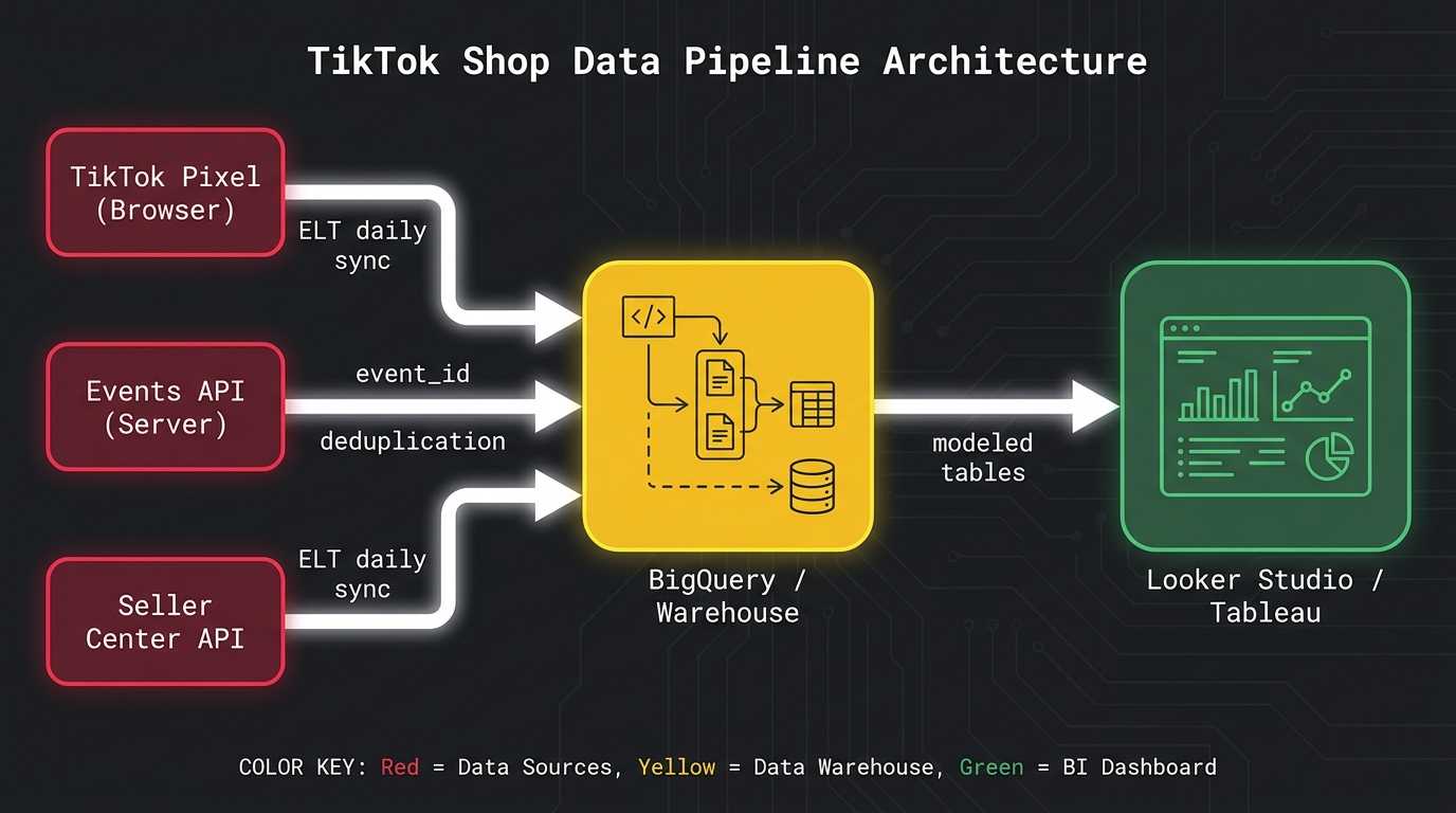
The foundation of any reliable TikTok Shop data layer is a hybrid tracking setup: the TikTok browser Pixel and the Events API (server-side), running simultaneously with event deduplication logic connecting them. TikTok has been explicit that this is the recommended configuration, and for good reason — each component has failure modes the other covers.
Why You Need Both, Not Either
The browser Pixel fires JavaScript from the user’s browser, which makes it fast and easy to implement but subject to ad blockers, browser privacy restrictions (particularly ITP on Safari), and cookie consent frameworks. On a TikTok-heavy audience — typically younger, mobile-first users — ad blocker rates in some demographics can reduce Pixel signal reliability by 20–35%.
The Events API sends conversion data directly from your server to TikTok’s servers, bypassing the browser entirely. This makes it far more reliable for downstream conversion events — Purchase, Checkout Completion — but it requires server-side implementation and proper customer data handling. In practice, the Pixel covers early-funnel events like PageView and ViewContent with good reliability, while the Events API handles mid-to-bottom-funnel events — AddToCart, InitiateCheckout, Purchase — with higher fidelity.
Event Deduplication: The Often-Skipped Step
Running both systems simultaneously creates a duplication risk: the same conversion event fires from both the browser Pixel and the server-side Events API. TikTok’s deduplication system uses a shared event_id parameter to match and consolidate these duplicate events. This field must be identical across both the Pixel and Events API calls for the same event instance.
Skipping deduplication means your attribution data inflates. TikTok’s systems will count the same purchase twice — once from the browser, once from the server — and your CPO metrics, campaign optimization, and ROAS calculations will all be wrong. The fix is straightforward in implementation: generate a unique event_id at the time of the event, pass it in both systems, and let TikTok’s backend reconcile them. But it must be deliberately built. It doesn’t happen automatically.
Ecommerce Data Layer Schema
The Pixel and Events API don’t exist in isolation — they sit on top of your ecommerce data layer, the structured JavaScript object that standardizes event data across your storefront. For TikTok Shop, the critical data layer fields for each event are:
- event: The event type (
ViewContent,AddToCart,Purchase, etc.) - event_id: Unique identifier for deduplication (ideally a UUID or order number for Purchase events)
- content_id: TikTok’s product ID, mapped to your internal SKU
- content_type: Always
productfor ecommerce - value: Item price or order value (use settled revenue, not GMV)
- currency: ISO currency code
- quantity: Units ordered
- order_id: Your internal order reference, critical for cross-system reconciliation
For sellers operating through TikTok’s native checkout (the Shop Tab), most of these events are handled automatically through TikTok’s own checkout infrastructure. The instrumentation work becomes more complex when you’re running a multi-channel operation — driving TikTok traffic to a Shopify or WooCommerce store, for example — because you’re now bridging TikTok’s attribution universe with your own transaction data.
Connecting to the Seller Center API
The third data source in your pipeline is the Seller Center API, which gives you order-level data including status, fulfillment, returns, and product-level breakdowns. TikTok has expanded Commerce API access in 2026, making it more viable to build automated data pulls into a warehouse. The critical data to extract from this source is order-level settlement data — confirmed revenue after refunds — which is what you need to correct your GMV-based metrics and build accurate contribution margin models.
Most well-instrumented shops in 2026 are using ELT connectors (tools like Supermetrics, Porter Metrics, or Dataslayer) to automate daily pulls from the Seller Center API and Ads Manager API into a central warehouse, typically BigQuery or Snowflake. This eliminates manual exports, creates an auditable history, and serves as the foundation for your command center dashboards.
The KPI Stack That Connects to Actual Profit
With a proper data layer in place, you can now define the specific KPIs that belong in your daily command center. The goal here is ruthless prioritization. A dashboard with 40 metrics isn’t a command center — it’s a data dump. Experienced operators tend to converge on three tiers of KPIs: daily pulse metrics you check every morning, weekly diagnostic metrics you review in depth, and monthly health metrics that tell you whether the business is on the right trajectory.
Daily Pulse Metrics
These are the metrics you look at first each morning to assess whether anything needs immediate attention. They should be fast to scan and clearly indicate when something is materially off.
- Net Settled Revenue: Actual collected revenue after refunds and cancellations, not GMV. This is the number that maps to cash flow.
- Orders by Traffic Source: Paid, organic, affiliate, and LIVE — segmented, not blended. A sudden shift in mix is often the first signal of a content problem or affiliate issue.
- Blended Cost Per Order (CPO): Total marketing spend (ads + affiliate commissions) divided by completed orders. This tells you whether acquisition economics are holding or deteriorating.
- Return/Refund Rate (48h window): Early signal for product or fulfillment issues. TikTok’s non-buyer-fault return rate is now a formal component of Shop Performance Score, so elevated returns have both P&L and visibility consequences.
- Live Session GMV-per-Viewer (on LIVE session days): The single most diagnostic metric for whether a session was commercially productive.
Weekly Diagnostic Metrics
These are the metrics you review in depth once a week, typically in a structured review session. They require more context to interpret and drive medium-term decisions.
- Conversion Rate by Traffic Source: Organic vs. paid vs. affiliate vs. LIVE, calculated separately. Trends over a week reveal whether specific channels are improving or degrading.
- Content-to-GMV Attribution: Which specific videos drove how much revenue in the past 7 days? This feeds your content production decisions.
- Affiliate Performance by Creator Tier: Top-tier vs. mid-tier vs. micro-affiliate conversion rates, click rates, and CPO. Determines where commission budget is best deployed.
- Average Order Value (AOV) by Channel: AOV from affiliate-driven buyers is often materially different from paid-driven buyers, which has significant implications for CAC targets.
- SKU-Level Contribution Margin: Which products are actually profitable after all costs are accounted for? (Expanded below.)
Monthly Health Metrics
Strategic indicators that tell you whether the business model is working at scale.
- Gross Margin Trend: Is the business maintaining margin as it scales, or is growth coming at the cost of profitability?
- Repeat Purchase Rate: TikTok Shop’s closed ecosystem makes repeat purchase tracking challenging, but it’s measurable through order-level customer email matching.
- Shop Performance Score Components: TikTok’s SPS incorporates logistics performance, review quality, and policy compliance. Systematic monitoring prevents sudden visibility penalties.
- Platform Fee Effective Rate: As TikTok’s commission rates shift (and they have shifted meaningfully through 2025 and into 2026), your effective blended fee rate as a percentage of net revenue deserves monthly reconciliation.
GMV Max Attribution: What It’s Reporting and Why That’s a Problem
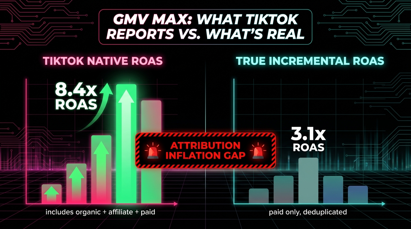
GMV Max is TikTok’s automated campaign type that uses machine learning to optimize toward maximum GMV across all traffic sources — paid, organic, and affiliate simultaneously. It’s genuinely powerful for scaling a shop’s total output. But its attribution model contains structural features that inflate reported ROAS in ways that matter enormously for how you read your own performance data.
How GMV Max Attribution Actually Works
TikTok’s own documentation makes this explicit, though it’s easy to miss: when a GMV Max campaign is running for a product, all relevant conversions for that product are attributed to the campaign — including organic sales that happened with no ad interaction whatsoever. This means if a creator’s organic video drives 500 orders for your hero SKU during the same period your GMV Max campaign is running, all 500 of those orders are credited to the GMV Max campaign in TikTok’s reporting interface.
The practical consequence is dramatic. Operators running active affiliate programs and organic content alongside GMV Max campaigns will see reported ROAS figures that look exceptional — sometimes 6x, 8x, or higher — because the campaign is taking credit for sales it did not cause. When advertisers and agency teams have compared TikTok’s reported GMV Max ROAS against independently measured incremental conversions, the gap has been substantial, with some accounts finding that true paid-only ROAS is less than half of what GMV Max reports.
The Organic Cannibalization Effect
There’s a related distortion that makes this worse. When GMV Max is active and claiming all conversions for a set of SKUs, you lose visibility into whether organic and affiliate content is actually working. The attribution gets collapsed into the campaign umbrella. Operators who pause GMV Max to test organic performance often discover that their organic content was carrying far more of the load than the attribution model suggested — and that their paid contribution was correspondingly smaller.
This doesn’t mean GMV Max is bad. It’s a legitimate scaling tool. But it must be evaluated against incrementality logic, not its own reported attribution. The standard approach for sophisticated operators is to run holdout tests: periodically exclude a geographic market or audience segment from GMV Max targeting, observe organic order rates in that holdout group, and use the gap to estimate true incrementality.
Building Your Own Attribution Reconciliation
In your command center, the fix for GMV Max attribution inflation is a separate reconciliation view built from your warehouse data. The model is straightforward in concept, though it requires clean order-level data:
- Pull all orders from Seller Center API with their source attribution (paid, organic, affiliate)
- Pull ad spend data from TikTok Ads Manager API for the same period
- Calculate a paid-only CPO by dividing total ad spend by orders attributed to paid sources only
- Compare this to TikTok’s blended GMV Max ROAS figure — the gap is your attribution inflation
This reconciliation view should live prominently in your command center alongside (not instead of) the native TikTok metrics. It’s the reality check that keeps budget decisions grounded in actual economics rather than platform-reported attribution.
Affiliate and Creator Attribution in a Multi-Source Data Model
TikTok Shop’s affiliate ecosystem is one of its most powerful levers — but also one of the hardest to measure accurately when you’re trying to understand which creators are actually driving profitable outcomes, not just volume.
What TikTok’s Native Affiliate Analytics Provides
The Affiliate Center within Seller Center gives you per-creator GMV, orders, and click data. You can see which affiliates are generating the most volume and, with some effort, calculate rough click-to-order rates. The challenge is that these metrics are again GMV-denominated and don’t incorporate any cost view. A creator driving 300 orders at $12 commission per order looks better than one driving 200 orders at $8 commission — until you factor in that the first creator’s audience returns products at 28% and the second’s returns at 6%. After returns and actual commission costs, the economics flip.
Building Creator-Level Profitability
Sophisticated affiliate attribution requires joining two datasets that don’t naturally connect in TikTok’s native UI: the Affiliate Center’s creator performance data and your order-level returns and fulfillment data from Seller Center API. The join key is the affiliate’s Shop ID or creator identifier attached to each order.
The output you want is a creator-level P&L that includes: total orders attributed, average order value, return rate, net settled revenue, total commission cost, and resulting net revenue after commissions. From this table, you can calculate a creator efficiency score — net revenue per dollar of commission paid — that tells you far more about who to invest in than raw GMV ever could.
Operators who build this model typically find that the top 20% of affiliates by GMV are not the same 20% by creator efficiency score. Commission budgets allocated by raw GMV overinvest in high-volume but low-margin creators and underinvest in mid-volume creators with excellent audience quality. Reallocating based on creator efficiency scores is one of the highest-leverage optimizations available to a TikTok Shop operator running at scale.
Attribution Window Logic
TikTok Shop’s default affiliate attribution window credits the last affiliate whose content touched a buyer’s journey. This is reasonable for commissions but creates measurement distortions at the portfolio level. A buyer who saw three different affiliate videos before purchasing attributes the full commission to video three — even though the first two played a substantial role in building purchase intent.
For reporting purposes, the most accurate approach is to segment creators by their typical position in the purchase funnel. Creators whose content is used as first touch (broad reach, high impressions, lower conversion rate) should be evaluated on different KPIs than creators whose content typically closes the sale (smaller reach, higher CTR, higher CTOR). Building this segmentation into your data model prevents you from cutting high-awareness creators because their last-touch attribution looks weak.
Live Shopping Metrics: Configuring the Signals Most Sellers Miss
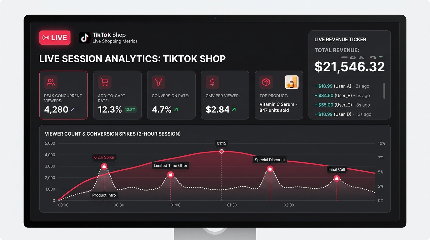
LIVE shopping is the highest-intent commerce surface TikTok has built, and yet it’s the surface most operators measure worst. The standard approach is to look at total LIVE GMV and call it a day. The operators who are building real competitive advantages in LIVE commerce are measuring it at a session-level granularity that the native Live Center dashboard approximates but doesn’t fully expose.
The Metrics That Define LIVE Session Quality
For any LIVE session, the five metrics that give you a complete operating view are:
- GMV per Viewer-Minute: Total session GMV divided by cumulative viewer-minutes. This normalizes for session length and audience size, making different sessions directly comparable regardless of how long they ran or how many people watched.
- Add-to-Cart Rate: Unique add-to-cart events divided by unique viewers. TikTok’s Live Center shows add-to-cart counts but often doesn’t surface the rate clearly. You need to calculate this from raw event data. Industry benchmarks for well-performing LIVE sessions sit in the 8–15% range; sessions below 5% suggest either a product-audience mismatch or a host effectiveness issue.
- Conversion Rate (ATCer → Buyer): Of viewers who added to cart, what percentage completed a purchase during the session? This isolates whether the cart abandonment is happening at a LIVE-specific friction point (checkout UX during a live, for example) or whether viewers are adding to cart and purchasing later (which is valuable but affects how you calculate real-time session ROI).
- Peak Concurrent Viewers and Viewer Retention Curve: Not just the peak number, but the shape of the retention curve across the session. Sharp drops at specific timestamps tell you where a session lost its audience — a product introduction that didn’t land, a host transition, a technical issue. This is actionable for coaching host teams and structuring future sessions.
- Product-Level LIVE Conversion Rate: Which specific SKUs sold during the session and at what conversion rate when featured? This is the data that informs LIVE product sequencing — leading with high-conversion products to build momentum versus saving a flagship product for peak concurrent viewership.
Extracting LIVE Data from TikTok’s API
TikTok’s Live Center provides session-level summaries, but granular event-level LIVE data requires API access. The LIVE event stream — viewer joins, add-to-cart events, purchases, exits — is available through TikTok’s developer API with appropriate permissions. Pulling this data into your warehouse allows you to build session-level analytics tables that persist historically, enabling comparison of host performance over time, day-of-week patterns, and product performance across multiple LIVE appearances.
Operators running regular LIVE sessions (three or more per week) who have invested in this level of data infrastructure can run structured experiments: same product, different host, different time slot, different promotional offer. The data infrastructure makes those experiments readable in ways that the native Live Center cannot replicate.
Building the Daily Command Center in Looker Studio or a BI Tool
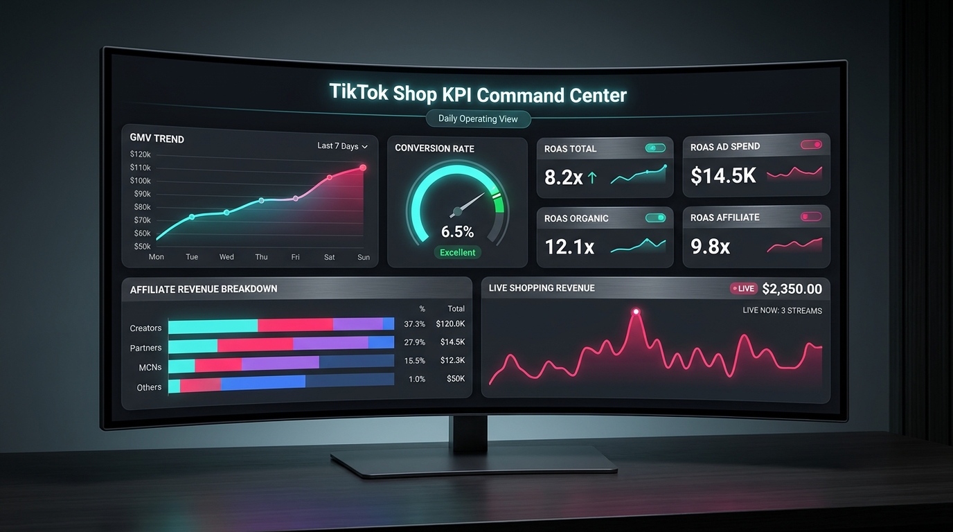
With your data layer instrumented, your warehouse loaded, and your KPI framework defined, the final build is the command center itself — the single dashboard (or compact dashboard suite) that synthesizes everything into a daily decision-making surface.
Architecture Choices: Looker Studio vs. Tableau vs. Custom
The most common stack for TikTok Shop operators in 2026 is BigQuery + Looker Studio for its cost-effectiveness and native Google integration. Looker Studio connects directly to BigQuery, refreshes on a scheduled cadence, and is free to use. Its limitation is visual flexibility — complex layout requirements or very custom chart types can become painful to build.
Tableau and Metabase are stronger choices for teams that need more sophisticated data exploration capabilities or have analysts who want to query raw data directly. The tradeoff is cost and setup complexity. For most operators, Looker Studio handles 90% of what’s needed at zero additional tooling cost.
Some high-volume operators and agencies build custom dashboards using Retool or Observable Framework, which allows more precise control over layout, alerting, and interactivity. This approach requires engineering resources but produces a purpose-built tool that’s faster and more focused than a general BI platform.
Command Center Layout: The Three-Panel Model
The most effective daily command center layouts follow a three-panel structure:
Panel 1 — Yesterday at a Glance: Net settled revenue, total orders, blended CPO, return rate (48h), and organic/paid/affiliate order split. Five to seven KPI tiles maximum, no charts. This panel answers: “Did yesterday’s business perform normally?”
Panel 2 — Trends Over 30 Days: Time-series charts for net revenue, conversion rate by traffic source, and creator efficiency score for top 10 affiliates. This panel answers: “Are the trends pointing in the right direction?”
Panel 3 — SKU-Level Contribution Margin Table: Your top 20–30 SKUs ranked by contribution margin (not GMV), with columns for net revenue, COGS, platform fees, commission cost, and fulfillment cost. This panel answers: “Which products should we prioritize, and which are destroying margin at scale?”
Automated Alerts: The Decision Layer
A command center that you passively read is less valuable than one that actively tells you when something needs attention. Most warehouse-plus-BI setups support threshold-based alerting via email or Slack integration. The alerts that generate the most operational value for TikTok Shop operators are:
- Return rate spike alert: If 48-hour return rate on any SKU exceeds your category benchmark by 1.5x, alert the operations team. This catches product quality or listing accuracy issues before they accumulate into SPS penalties.
- CPO deterioration alert: If blended CPO on paid traffic rises more than 20% above the 7-day rolling average, alert the paid media team. This catches targeting decay, creative fatigue, or bid competition changes before they become expensive.
- Affiliate drop-off alert: If weekly affiliate-driven orders decline more than 25% relative to the prior week, alert the creator partnerships team. This often indicates a top creator’s content aging out and needing refresh.
- LIVE session benchmark miss: If a completed LIVE session produces GMV-per-viewer more than 30% below the account average, flag it for review. These sessions often reveal coaching opportunities for host teams.
SKU-Level Contribution Margin: The Operator’s True North
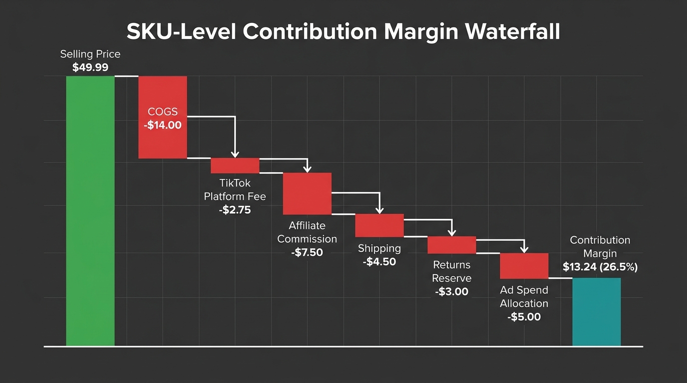
Of all the metrics in the command center, none is more operationally important — and more consistently underbuilt — than SKU-level contribution margin. Most TikTok Shop operators think about profitability at a business level. The operators who scale efficiently think about it at a SKU level, updated daily.
What Goes Into the Contribution Margin Model
Contribution margin per SKU is the selling price minus every variable cost directly attributable to that unit. On TikTok Shop, those variable costs include:
- Cost of Goods Sold (COGS): The unit cost of the product itself, including landed cost and any import duties.
- TikTok Platform Commission: TikTok’s fee on each transaction, which varies by category and has been revised upward in 2026. As of mid-2026, rates in major US categories range from approximately 5–8% of the selling price.
- Affiliate Commission: The percentage paid to the creator or affiliate who sourced the sale. This varies by product, category, and individual creator agreement. For a product with a 15% commission rate and heavy affiliate reliance, this is often the second-largest variable cost after COGS.
- Fulfillment and Shipping Cost: Per-unit fulfillment cost including pick-and-pack and outbound shipping. For heavier products or sellers using third-party logistics, this can represent 10–15% of selling price at low AOVs.
- Return Reserve: Expected cost of returns, modeled as (return rate × [unit COGS + return shipping cost]). For fashion categories running 20% return rates, this reserve is material and must be included in any honest margin model.
- Allocated Ad Spend: Paid ad spend attributable to the SKU, divided by orders generated. This converts channel-level ad spend into a per-unit cost.
The waterfall from selling price through each of these deductions arrives at your SKU-level contribution margin — the dollar amount each unit actually contributes to covering fixed overhead and generating profit.
Why This Changes Every Major Decision
Operators who implement SKU-level contribution margin tracking almost universally find that their GMV-ranked and margin-ranked product lists look very different. The SKU with the highest GMV is often not the most profitable — it may carry high return rates, heavy affiliate commissions, and expensive fulfillment, resulting in a contribution margin of 8–12% despite being the top-line revenue leader.
Meanwhile, a SKU in the middle of the GMV table with simpler logistics, lower return rates, and an organic content-driven audience might be generating 30–35% contribution margins. That product deserves far more inventory investment, content production resources, and LIVE featuring time than its GMV rank suggests.
The specific benchmarks vary considerably by category, but as a general reference point: beauty and personal care SKUs on TikTok Shop typically achieve higher contribution margins (25–35% range) than apparel SKUs (often 15–22% after return reserves), largely due to lower return rates and smaller fulfillment dimensions. Understanding where your SKUs fall relative to category norms is the starting point for any intelligent inventory or content investment decision.
Building the Daily Margin Update
The margin model itself can be built as a static spreadsheet initially, but it becomes a command center asset when it’s automated: COGS from your ERP or inventory system, platform fees from the Seller Center API order data, affiliate commissions from the Affiliate Center export, fulfillment costs from your 3PL API or internal ops system, and return rate from a rolling 30-day window on order data. Most of these data sources can be connected to a warehouse with existing connectors; a few may require lightweight custom scripts.
The output is a daily-refreshing SKU margin table that surfaces the products that need immediate attention — either because margins have declined due to cost changes, or because return rates have spiked, or because a commission adjustment has changed the unit economics. Catching these changes daily rather than in monthly reviews is the difference between managing profitability and reacting to its absence.
From Reporting to Operating: Turning the Command Center Into Daily Decisions
The command center is not a reporting tool. Reporting is descriptive — it tells you what happened. A command center is prescriptive — it tells you what to do. This distinction determines whether the investment in building the infrastructure actually generates returns.
The Daily Operating Rhythm
Operators who get the most value from data infrastructure build a structured daily rhythm around it. This doesn’t mean spending hours analyzing dashboards every morning. It means a 15-minute daily review with a clear protocol:
- Check yesterday’s pulse panel (2 minutes): Scan net revenue, orders, CPO, and return rate against prior-day benchmarks. If all are within normal range, move on. If any alert has fired, flag for the relevant team.
- Check the 7-day trend lines (5 minutes): Look for any directional changes in conversion rate by channel. A trend deteriorating over 3–4 days is actionable before it becomes a crisis.
- Check the margin table (5 minutes): Which SKUs changed position? Any product whose contribution margin dropped materially since yesterday warrants investigation — usually a return rate spike or a fulfillment cost change.
- One priority action per team (3 minutes): Based on the review, each relevant team (content, media buying, creator partnerships, ops) gets a single priority for the day. Not five priorities. One.
This rhythm works because the infrastructure does the analytical heavy lifting overnight, and the morning review focuses exclusively on decisions rather than data gathering. The contrast with the alternative — manually pulling Seller Center reports, exporting CSVs, copying numbers into spreadsheets — is stark. Teams operating without this infrastructure typically spend more time collecting data than acting on it.
Weekly and Monthly Review Cadences
The daily pulse review is supplemented by a deeper weekly diagnostic session (30–45 minutes) that covers creator efficiency scores, content-to-GMV attribution analysis, and weekly trend patterns. This is where decisions about creator investment, content production priorities, and promotional strategy get made.
Monthly reviews use the health metric tier — gross margin trends, repeat purchase rates, SPS component scores — to make structural decisions: which product categories to expand, where inventory investment is most justified, whether current affiliate commission rates are sustainable given actual creator efficiency.
The cadence structure ensures that daily metrics drive daily decisions (CPO spike → adjust bids), weekly metrics drive weekly decisions (creator efficiency decline → change commission allocation), and monthly metrics drive strategic decisions (margin compression → renegotiate COGS or raise price). Collapsing all of these into a single weekly all-hands review — as many teams do — means strategic signals get treated as operational problems and operational signals get delayed by a week.
Building the Team Culture Around Data
The most technically sophisticated command center in the world generates zero value if the team doesn’t use it. The cultural element matters as much as the technical one. Teams that successfully build data-driven operating cultures share a few consistent habits: the dashboard is referenced in every team meeting (not just dedicated analytics reviews), questions about performance are answered by pointing to the dashboard rather than by recalling numbers from memory, and decisions are explicitly tied to specific data points in the command center.
This sounds obvious. But in practice, many teams build strong dashboards and then continue operating on intuition and anecdote because the dashboard isn’t integrated into their existing workflow. The fix is structural: make the command center the first tab open in every review meeting, and make “what does the data show?” the first question asked about any performance question before opinions are offered.
Conclusion: The Data Layer Is the Business Layer
The TikTok Shop operators who will define the next two years of social commerce aren’t necessarily the ones with the best products or the most charismatic hosts or the highest ad budgets. They’re the ones who understand that at scale, the data layer is the operating layer. Every decision about what to make, who to partner with, what to promote in a LIVE session, and how much to bid on a campaign flows through the quality of your data infrastructure.
The native Seller Center dashboard will always be useful as a summary view. But summary views don’t tell you that your best-selling SKU is destroying margin, or that your most-promoted affiliate is driving high-return-rate buyers, or that your GMV Max ROAS figure is inflated by organic traffic you would have gotten anyway. Building the data layer to expose these realities isn’t a technical exercise — it’s a strategic one.
The path forward has clear steps:
- Instrument first. Deploy the hybrid Pixel + Events API setup with proper deduplication. Without reliable event data, nothing downstream is trustworthy.
- Build the warehouse layer. Connect Seller Center API, Ads Manager API, and Affiliate Center data to a central warehouse with daily automated pulls. This eliminates manual data collection permanently.
- Define the KPI framework. Three tiers: daily pulse, weekly diagnostic, monthly health. No more than 5–7 metrics per tier. Ruthless prioritization over comprehensive coverage.
- Build the correction views. GMV to Net Revenue reconciliation. GMV Max attribution inflation adjustment. Creator efficiency scores adjusted for returns. These corrections transform reported numbers into real ones.
- Add the contribution margin model. SKU-level, daily-refreshing, incorporating all variable costs. This becomes the single most important table in your command center.
- Configure alerts. Return rate spikes, CPO deterioration, affiliate drop-offs, LIVE session benchmark misses. Let the system surface what needs attention so you can focus on what to do about it.
- Build the operating rhythm. 15 minutes daily, 45 minutes weekly, structured monthly. The discipline of consistent review is what converts data infrastructure into business results.
TikTok Shop is now large enough, and competitive enough, that operating on intuition and dashboard summaries is no longer a viable strategy at scale. The operators who build the data infrastructure now will have a compounding advantage: not just better decisions today, but a growing history of structured data that makes every future decision faster, better-calibrated, and more defensible.
The command center is ready to build. The data is already there, waiting to be properly plumbed.