
Want to boost your ecommerce conversion rate? The secret isn't just one magic fix. It’s about a methodical process of finding and eliminating the friction points that stop shoppers dead in their tracks. It all begins with a data-first audit to see where customers are dropping off. From there, you can start optimizing your product pages, checkout flow, mobile experience, and even the ads that bring people to your site in the first place.
Conducting a Smart Ecommerce Conversion Audit
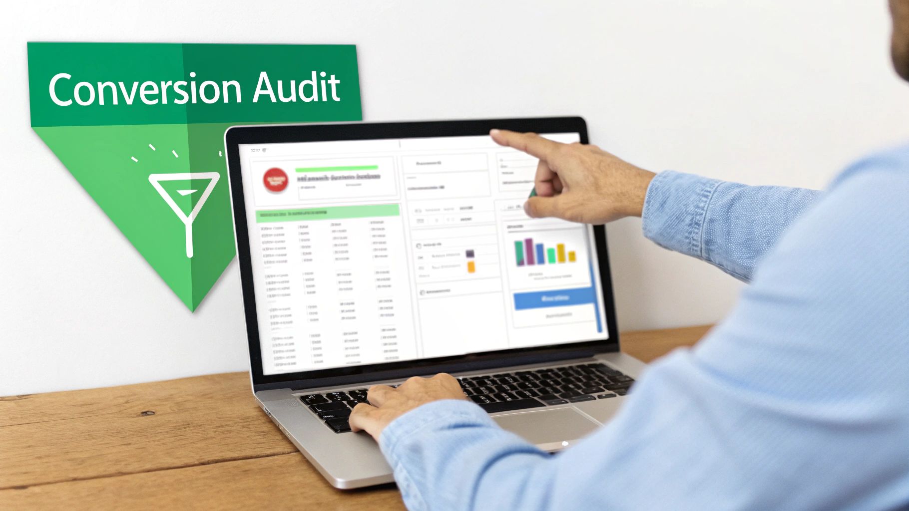
Before you touch a single button, tweak a headline, or change an image, you have to know what's actually broken. A smart conversion audit is your first move, taking you from pure guesswork to a concrete, data-backed plan. This isn't about chasing vanity metrics. It’s about becoming a detective and decoding user behavior to find the real moments of frustration that are killing your sales.
The goal is simple: pinpoint exactly where and why potential buyers are leaving. So many brands jump straight to solutions without a proper diagnosis, wasting time and money on changes that don’t move the needle.
Start with Your Sales Funnel Data
Your analytics dashboard is ground zero for any real audit. Whether you’re using Google Analytics 4, Amazon Brand Analytics, or the tools built into TikTok Shop, your first job is to trace the customer journey.
Look for the big, glaring drop-offs between these make-or-break steps:
- Landing Page to Product Page: Are people hitting your page from an ad and immediately bouncing?
- Product Page to Add to Cart: Are they looking but not committing?
- Add to Cart to Checkout: How many carts are being abandoned?
- Checkout to Purchase: Where in the final steps are they getting stuck?
Practical Example: An Amazon seller noticed a high click-through rate from their PPC ads but a terrible add-to-cart rate on their main product page. Instead of just blaming the ad, they dug into their analytics. The lightbulb moment? They saw that 90% of the traffic was coming from mobile. This completely shifted their focus to investigating and fixing the mobile experience of that specific listing, leading them to discover their main image text was unreadable on small screens.
Decode User Behavior by Segmenting Data
Looking at your overall data is like trying to see the details of a painting from across the room. The real story emerges when you segment your audience and compare how different groups behave. This is how you connect the what (the drop-off) with the why (the cause of the friction).
Start slicing your conversion data by these key segments:
- Device Type: Pit desktop, mobile, and tablet performance against each other. A sky-high cart abandonment rate that only happens on mobile might scream "clunky payment form" or "slow-loading images."
- Traffic Source: See how users from Google Ads, organic search, and social media act differently. Visitors from a highly targeted ad campaign should, in theory, convert better than someone who stumbled in from a general awareness post.
- New vs. Returning Visitors: If your returning visitors convert like champs but new users bail, it could be a sign that your site lacks trust signals or your value proposition isn't clear enough for first-timers.
For a deeper dive into improving your store's performance, it's worth exploring other strategies to increase e-commerce conversion rates and sales. This resource provides a great overview of additional tactics you can layer in.
Build Your Data-Backed Action Plan
Once you've found the biggest leaks in your funnel, you can start forming educated guesses—hypotheses—to test. This structured approach is what makes sure your optimization efforts are targeted and measurable. Your audit shouldn't just be a list of problems; it should be a prioritized to-do list of potential solutions.
Here’s a step-by-step workflow for this process:
- Observation: Data from the TikTok Shop dashboard shows a bounce rate over 80% on a specific product page for users coming from in-feed ads.
- Hypothesis: The product video on the page is auto-playing with loud audio, annoying users and causing them to leave instantly.
- Action: A/B test time. Duplicate the page, but turn off the auto-play video on the new version. Send 50% of the ad traffic to the original page and 50% to the new one.
- Measurement: Track the bounce rate and add-to-cart rate for both versions over a week to see which one performs better.
This is how you turn a vague problem like "low conversions" into a specific, testable, and ultimately solvable issue.
Optimizing Your Product Detail Pages
Once your audit flags some underperforming product pages, that’s where the real fun begins. Your product detail page is your digital storefront—it's the final, crucial pitch before a shopper either hits "add to cart" or vanishes forever. This is the moment casual browsing needs to become a decisive purchase.
Think of it as the ultimate moment of truth. If a customer has made it this far, they’re interested. Your only job is to vaporize every last bit of doubt and make your product’s value impossible to ignore.
Craft Visuals That Replace the In-Store Experience
In ecommerce, your photos and videos aren’t just eye candy. They’re your best tools for building trust and answering questions your customers haven't even thought to ask yet. Shoppers can't touch, feel, or try on your product, so your visuals have to do all the heavy lifting.
High-quality, multi-angle photography isn't optional anymore. But you need to go way beyond the basic studio shot on a white background.
- In-Use Shots: Show the product in a real-world context. Selling a backpack? Get a shot of it on someone hiking. A coffee mug? Show a person actually enjoying a warm drink. This helps shoppers mentally place the product into their own lives.
- Scale and Detail: You need images that give a clear sense of scale, maybe next to a common object or held in a person's hand. Use super high-res close-ups to show off material textures, quality stitching, or unique features that justify the price.
- User-Generated Content (UGC): Nothing sells like social proof. Featuring photos and videos from actual customers shows your product being enjoyed by real people, which feels miles more authentic than even the most polished brand imagery.
Practical Example: An Amazon seller selling a portable blender swapped their main "hero" image from a sterile studio photo to a vibrant lifestyle shot of someone making a smoothie at the gym. They tracked click-through and conversion rates for both versions over two weeks. The result: the context-rich lifestyle image increased conversions from ad traffic by 18%.
Write Product Descriptions That Sell Outcomes
Your product description has one job: to anticipate and answer every single question a potential buyer might have. People don't buy features; they buy the solutions and outcomes those features deliver. Great copy always connects the "what" (the feature) to the "so what" (the benefit).
Instead of this:
- "Made with 100% waterproof nylon."
Try this:
- "Built with 100% waterproof nylon, so you can walk through an unexpected downpour without a second thought about your gear getting soaked."
And remember, people scan online—they don't read. Structure your descriptions for scanners by using a mix of short paragraphs, bullet points, and bold text to make key information pop. For a deeper dive, check out our complete guide to Amazon listing optimization.
Leverage Strategic Pricing and Transparency
The way you price and present your product can make or break a sale. It’s not just about the number itself, but the psychology behind it.
Psychological Pricing: That classic trick of pricing an item at $29.99 instead of $30.00 still works. It’s called the "left-digit effect," where our brains anchor to the "2" and perceive the price as being in the $20 range. It’s a tiny change with a surprisingly big impact.
Tiered Options and Bundles: Giving customers a few choices can actually boost conversions by giving them a sense of control.
- Good: Basic Product – $20
- Better: Product + Accessory – $28 (Best Value!)
- Best: Full Kit – a$35
This kind of structure anchors the perceived value and often nudges buyers toward that middle, higher-margin option.
Price Transparency: Hidden fees at checkout are the #1 killer of conversions. Be completely upfront about shipping costs. Even better, build them into the product price and offer "free" shipping. A progress bar in the cart like, "You're only $12 away from free shipping!" is another killer tactic for bumping up that average order value.
Ultimately, your goal is to understand what customers expect in your specific category. The numbers don't lie: industry-specific conversion rates vary wildly, with personal care and food & beverage leading at 6.8% and 4.9%, while luxury goods and home decor lag way behind at 0.94% to 1.4%. This nearly 7x difference shows just how much product category shapes what a customer needs to see before they’re willing to buy. You can dig into more of this data in this report on e-commerce industry conversion rates on Statsig.com.
Fine-Tuning Your Mobile and Checkout Experience
If your product page is the final pitch, your checkout is the handshake that seals the deal. But this is exactly where countless brands drop the ball, especially on mobile. A slow, confusing, or clunky checkout is the fastest way to turn a motivated buyer into just another abandoned cart statistic.
The modern shopper has zero patience for friction. They expect a seamless path from cart to confirmation. Any little hiccup—an extra form field, a slow-loading payment page, or a surprise shipping fee—is more than enough to send them packing for good. Making this final step effortless isn't a small tweak; it's fundamental to improving your conversion rate.
Design for Thumbs, Not Cursors
First things first: you have to accept that the majority of your traffic is coming from phones. This isn't a debate anymore. Understanding how to optimize for different devices is critical, because the performance gap between desktop and mobile is still massive.
According to the latest benchmarks, desktop conversion rates typically hover between 3.9% and 4.8%. Mobile? A much lower 1.8% to 2.9%. That gap is a huge deal when you realize mobile now accounts for 73% of all global ecommerce traffic. For a deeper dive, check out the full report on ecommerce benchmarks from Speedcommerce.
This means your entire site, but especially your checkout, needs to be built for thumbs.
- Big, Tappable Buttons: Make sure your CTAs and form fields are large enough to be easily tapped without frustrating zoom-ins or accidental clicks.
- Minimalist Forms: On a small screen, every field you ask them to fill out feels like a chore. Strip it down to the absolute essentials. Use autofill for addresses and payment info wherever you can.
- Thumb-Zone Navigation: Key navigation buttons should be within easy reach of a user's thumb, which usually means along the bottom of the screen.
Practical Example: A Shopify store owner noticed a high drop-off rate at the payment step on mobile. They ran an A/B test. Version A had the "Proceed to Payment" button at the top-right of the screen. Version B used a sticky bar at the bottom, keeping the button constantly accessible to the user's thumb. This one change increased their mobile checkout completion rate by 11%.
Ecommerce Conversion Rates by Device
The numbers don't lie—mobile is where the traffic is, but it's also where conversions go to die without proper optimization. This table breaks down the typical performance you can expect by device, highlighting the huge opportunity for growth by closing the mobile gap.
| Device Type | Average Conversion Rate | Key Optimization Focus |
|---|---|---|
| Desktop | 3.9% – 4.8% | Rich media, detailed information, multi-tab comparisons, and a feeling of security. |
| Mobile | 1.8% – 2.9% | Speed, one-click payments, thumb-friendly design, and minimal data entry. |
| Tablet | 3.3% – 4.2% | A hybrid experience that blends mobile's touch-friendliness with desktop's visuals. |
Focusing on a mobile-first checkout isn't just about keeping up; it's about meeting your customers where they are and making it incredibly easy for them to give you their money.
Radically Simplify the Checkout Flow
The best checkout process is one the customer barely even remembers. Your goal is to eliminate every single point of friction and make the path to purchase feel secure, automatic, and almost invisible.
Here’s a practical workflow to slash your checkout abandonment rate:
- Step 1: Offer Guest Checkout (Prominently!): Forcing someone to create an account before they can buy is a classic conversion killer. Let them check out as a guest, no strings attached. You can always invite them to create an account on the confirmation page after you’ve secured the sale.
- Step 2: Integrate One-Click Payments: Digital wallets like Apple Pay, Google Pay, and Shop Pay are no longer optional. They let customers bypass all the tedious form-filling, turning a multi-step chore into a single, secure tap. This is easily the highest-impact change you can make to your mobile checkout.
- Step 3: Use a Visual Progress Bar: Show people where they are in the process (e.g., Shipping > Payment > Confirm). It reduces anxiety by setting clear expectations and showing them the finish line is just a step or two away.
The chart below shows just how much conversion rates can vary by product category, reminding us that every industry has its own unique customer expectations.
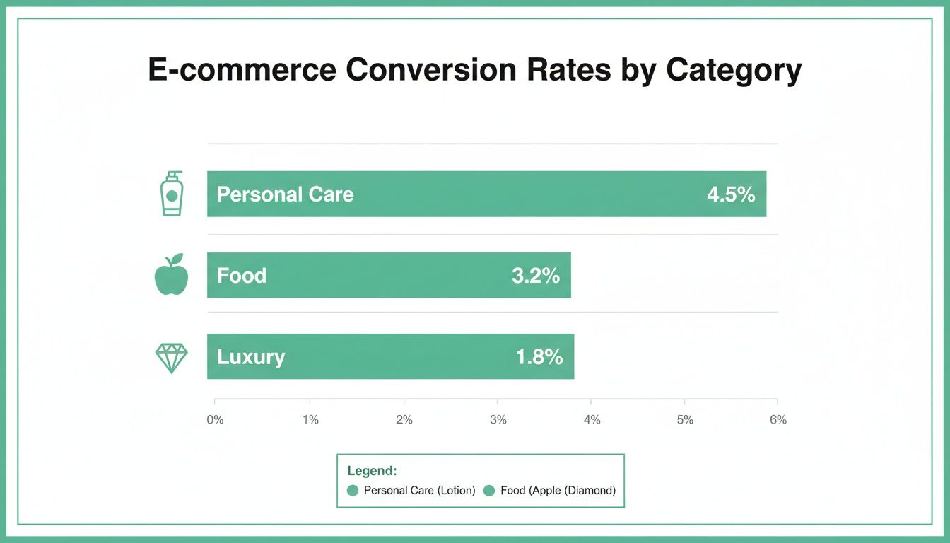
This data suggests that customers buying personal care items are often making quicker decisions, while luxury shoppers might need more trust signals and a premium, white-glove checkout experience to feel comfortable converting.
Let Marketplaces Do the Heavy Lifting
If you're selling on platforms like Amazon or TikTok Shop, a massive part of the optimization work has already been done for you. These giants have poured billions into perfecting their native checkout flows. Your job is to simply align your listings with their systems to cash in.
Practical Steps for Amazon Sellers:
Your number one focus here should be making sure your product is Prime-eligible. That "Buy Now" button is one of the most powerful conversion tools on the internet, and it's tied directly to FBA or Seller Fulfilled Prime. Keep your inventory levels accurate to avoid stockouts that disable this one-click magic.
Practical Steps for TikTok Shop Sellers:
TikTok is a mobile-first universe, and its checkout is built for impulse buys. It's seamlessly integrated right into the app. To win here, your video content has to do the selling in seconds. A practical example is creating a 15-second video demonstrating one key benefit of your product, with a clear call-to-action overlay pointing to the "Shop" button. The user can tap it and complete a purchase without ever leaving the video.
Aligning Ad Campaigns with Landing Pages
Pouring money into ad campaigns without a solid bridge to your product pages is one of the fastest ways to torch your budget. Sure, driving traffic is half the battle, but the real work begins when you have to turn that expensive click into a profitable sale.
The moment a user clicks your ad, you've made a promise. If your landing page doesn't instantly deliver on that promise, trust is broken. They'll hit the back button without a second thought, and your ad spend goes right down the drain.
This critical link between your ad and landing page is what we call message match. It’s the simple but powerful idea that your ad's headline, visuals, and offer must be perfectly mirrored the second a user lands on your site. A broken promise is a one-way ticket to a high bounce rate.
The Power of a Seamless Experience
When a potential customer sees an ad that speaks directly to their needs, they form a crystal-clear expectation. They expect to see the exact same product, the same language, and the same offer on the page that loads. Any mismatch creates cognitive friction—that split-second of confusion where the user has to ask, "Wait, is this what I was looking for?" That hesitation is a total conversion killer.
Practical Example: Imagine someone searches Google for "waterproof running shoes for wide feet." They click an ad promising exactly that. But the landing page dumps them on a generic category page for all running shoes, forcing them to start their search all over again with filters. Most won't bother. You just lost a sale, not because your product was wrong, but because the journey was broken.
The core principle is this: when the information a user sees matches the expectations they already have, their perceived risk plummets and engagement skyrockets. Strong message match removes friction at the moment of highest intent, which is a key factor in boosting your conversion rate from paid traffic.
How to Audit Your Ad-to-Landing-Page Funnel
To make sure your ad spend is actually making you money, you need a workflow for auditing your campaigns. This isn't a one-time fix; it's a continuous process of review and refinement.
Here's a step-by-step audit process:
- Select Your Highest-Spending Campaign: Start where you have the most data and the biggest investment.
- Review the Ad Creative and Copy: Look at the exact headline, description, and image you're using. What specific problem does it solve? What benefit does it promise? Is it shouting "Limited-Time Discount" or "Free Shipping"?
- Click Through to the Landing Page: Put yourself in your customer's shoes. Click the ad. When the page loads, is the promise from the ad the very first thing you see? Is the headline a direct reflection of the ad copy?
- Confirm Search Intent Alignment: Does the product page directly solve the problem implied by the search term? If someone searched for a specific feature, that feature better be highlighted prominently above the fold. For anyone running Amazon ads, this alignment is non-negotiable. You can dive deeper into refining your campaigns in our guide on maximizing your advertising success with Amazon PPC management.
A Real-World Example:
An Amazon seller is running a sponsored ad for the keyword "organic baby lotion for eczema."
- Weak Alignment: The ad links to their standard baby lotion product page. The word "eczema" is buried in the fifth bullet point, and "organic" is only mentioned way down in the A+ content. The user has to hunt for the info they need.
- Strong Alignment: The ad links to a page where the main image has text overlay reading "Soothes Eczema-Prone Skin." The product title leads with "Organic Eczema Relief Baby Lotion," and the very first bullet point addresses its gentle, hypoallergenic formula. This instantly confirms the shopper is in the right place.
Optimizing for Every Funnel Stage
Message match isn't just for those bottom-of-funnel, ready-to-buy keywords. It applies to every single stage of the customer journey.
- Top of Funnel (Awareness): If a Facebook ad shows a lifestyle video of your product solving a common problem, the landing page shouldn't be a sterile product grid. It should lead with that same video or similar lifestyle shots to continue the narrative.
- Middle of Funnel (Consideration): Running an ad that highlights a feature comparison, like "Why our blender is quieter"? It needs to link to a section on the product page that immediately proves that claim with decibel ratings, customer testimonials, or a demo video.
- Bottom of Funnel (Retargeting): A retargeting ad showing the exact product a user abandoned in their cart should link directly back to that product page. Even better? Link them straight to their pre-filled cart to make checking out ridiculously easy.
Use AI and Automation to Actually Move the Needle on Conversions

Let's be honest, manual effort can only get your store so far. To really scale your conversion rate, you need systems working for you around the clock. This is where AI and automation come in, acting like a tireless digital team that personalizes shopping trips, claws back lost sales, and spots problems before they turn into disasters.
This isn't about chasing some complex, expensive tech dream. It’s about putting smart, accessible tools to work that build a more responsive and profitable store.
Personalize the Shopping Experience at Scale
AI’s biggest superpower in ecommerce is making every visitor feel like an individual. The days of showing everyone the same static storefront and "top sellers" are long gone. Today’s tools can dynamically change what each shopper sees based on what they're actually doing, which dramatically increases the chance of a sale.
- AI-Driven Product Recommendations: This is way more than just a "you might also like" widget. Practical example: A customer who previously bought a specific brand of running shoes returns to the site. Instead of a generic "Top Sellers" list, the AI-powered recommendation engine shows them new arrivals from that same brand, plus socks and hydration packs commonly purchased by other runners who bought the same shoes.
- Dynamic Pricing Engines: Imagine your prices automatically adjusting based on a competitor's sale, your current inventory, or a sudden spike in demand. AI can do that, keeping you competitive without you having to manually check prices all day. You'll capture sales when demand is hot and move stock when things are slow.
Key Takeaway: Personalization isn't a bonus anymore—it’s an expectation. Shoppers who see content and products tailored to them are simply far more likely to buy. AI makes this level of personalization possible for any size business, creating a much more engaging journey from the very first click.
Put Your Sales Recovery on Autopilot
Every single abandoned cart is a potential sale that slipped away. Manually chasing down every one of those shoppers? Impossible. But automated systems can work 24/7 to bring them back into the fold. Setting up these flows is easily one of the highest-impact automations you can build to boost your ecommerce conversion rate.
An abandoned cart email sequence is the perfect place to start. Here's a simple, effective 3-step workflow that just works:
- Email 1 (1-3 hours later): Send a gentle, helpful email. The tone should be less "Hey, buy this!" and more "Did you run into any trouble?" Pop in a picture of the item and a direct link straight back to their cart.
- Email 2 (24 hours later): Time to create a little friendly urgency. Remind them the item is still waiting for them but might not be for long. You could also highlight a key benefit or a rave review they might have missed.
- Email 3 (48-72 hours later): If they still haven't bitten, this is your last shot. A small, time-sensitive discount like "10% off for the next 24 hours" can be the final nudge they need to pull the trigger.
This entire process runs on its own, recovering revenue you would have otherwise written off as lost. For businesses ready to build out more sophisticated systems, looking into AI automation services can give you a structured path to creating these powerful, self-sustaining workflows.
Implement AI-Powered Monitoring and Support
Finally, think of AI as your store's ever-watchful security guard. A sudden drop in your conversion rate could mean anything—a broken payment gateway, a bug on a product page, or a new competitor suddenly undercutting all your prices.
AI-powered monitoring tools can track your most important metrics in real-time and ping you the second something looks off. This proactive approach means you can fix critical issues in minutes, not days, saving you from a massive revenue headache.
On top of that, AI-powered chatbots can handle common customer questions 24/7, instantly answering queries about shipping, returns, or product specs. When done right, strategies for leveraging chatbots lead generation can even turn simple support chats into direct sales opportunities by guiding shoppers to the exact products they need.
Your Top Ecommerce CRO Questions, Answered
Diving into conversion rate optimization often feels like opening a can of worms—solve one problem, and three more pop up. Even with a solid plan, you'll hit unique roadblocks. Let's tackle some of the most common questions we hear from sellers, with straightforward advice you can actually use.
What Is a Good Ecommerce Conversion Rate?
This is the million-dollar question, but the honest answer is: it depends entirely on your industry. People love to throw around the general benchmark of 1% to 3%, but that average is pretty much meaningless without context.
Practical Example: A store selling cheap, impulse-buy phone cases might easily see a 4-5% conversion rate because the purchase decision is low-risk and fast. On the other hand, a merchant selling high-end, custom furniture with a much longer, more considered buying cycle would be thrilled with a rate of 0.8%, as each sale is significantly more valuable.
Your real goal shouldn't be to chase some generic number. Instead, figure out your own baseline and focus on making consistent, incremental improvements. Track your rate month-over-month and just aim for steady growth from there.
How Long Should I Run an A/B Test?
Cutting an A/B test short is a classic mistake, and it gives you data you can't trust. A test needs to run long enough to achieve statistical significance, which is just a fancy way of saying you're confident the results aren't a fluke.
A solid rule of thumb is to let a test run for at least two full business cycles—that's typically two weeks for most stores. This helps even out the natural ups and downs between a busy Saturday and a slow Tuesday. The real key, though, is hitting a big enough sample size. You're usually looking for at least 1,000 conversions per variant to get reliable data.
Practical Example: You are testing a new product page headline. After two days, Version B is ahead by 20%. Don't stop the test! A weekend sales rush could completely flip the results. Wait the full two weeks to ensure your data accounts for different weekly buying patterns and isn't just a random spike. Patience is what gets you data you can actually build on.
What Changes Have the Highest Impact on a Tight Budget?
When you're working with limited resources, you have to be smart. Focus on the changes that fix the biggest points of friction for your customers without costing a fortune in development time. These "low-hanging fruit" optimizations can deliver a serious return without draining your bank account.
Here are three high-impact, low-cost areas to hit first, with practical steps:
- Nail Your Value Proposition: Action: Go to your top 3 product pages and rewrite the headline and the first sentence. Can you state the #1 benefit of your product more clearly in under 10 words? This is a simple copy change that costs nothing but can dramatically improve how well customers "get" what you're selling.
- Fix Your "Add to Cart" Button: Action: Change your main call-to-action button to a contrasting color that pops off the page (e.g., orange on a blue-themed site). Test compelling, benefit-driven text like "Get Better Sleep Now" instead of the stale "Add to Cart."
- Add Trust Signals at Checkout: Action: This one is huge and takes minutes. Add a small image strip of the payment method logos you accept (like Visa, PayPal, Apple Pay) and a security badge (like "Secure SSL Checkout") right near the payment fields. This instantly crushes anxiety and boosts a shopper's confidence right when it matters most.
At ZonFlip, we transform these CRO principles into profitable actions. Our team provides end-to-end management for Amazon and TikTok Shop, from optimizing listings and running PPC campaigns to implementing AI-powered automations. We help brands sell more and work less. Discover how ZonFlip can accelerate your ecommerce growth today.